
 S-VYASA
"The website had everything. It just didn't help students decide."
Students were landing on program pages and landing pages, reading content, scrolling and leaving without applying. The problem wasn't the information. It was the absence of direction.
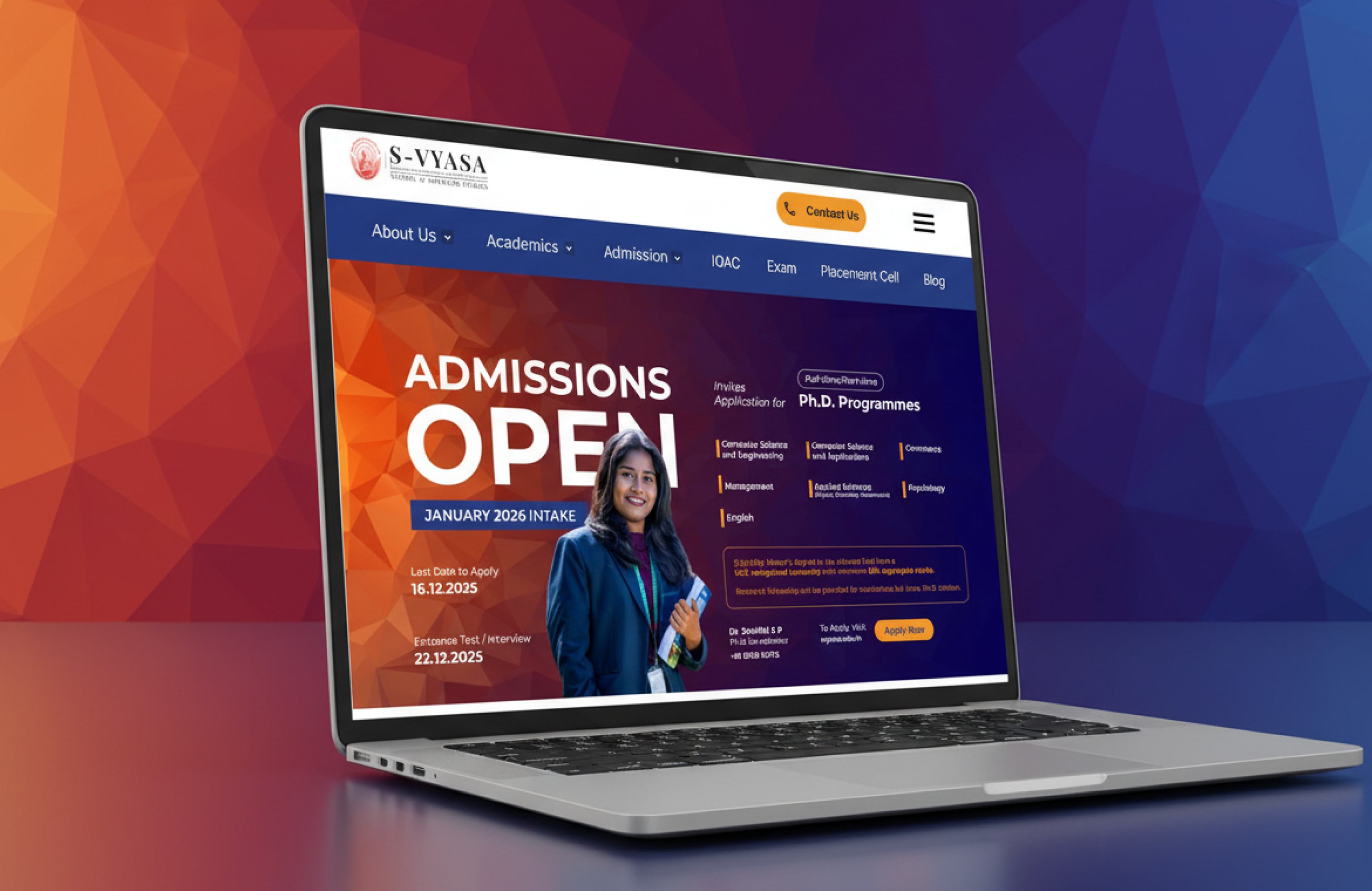
One problem. Stated clearly.
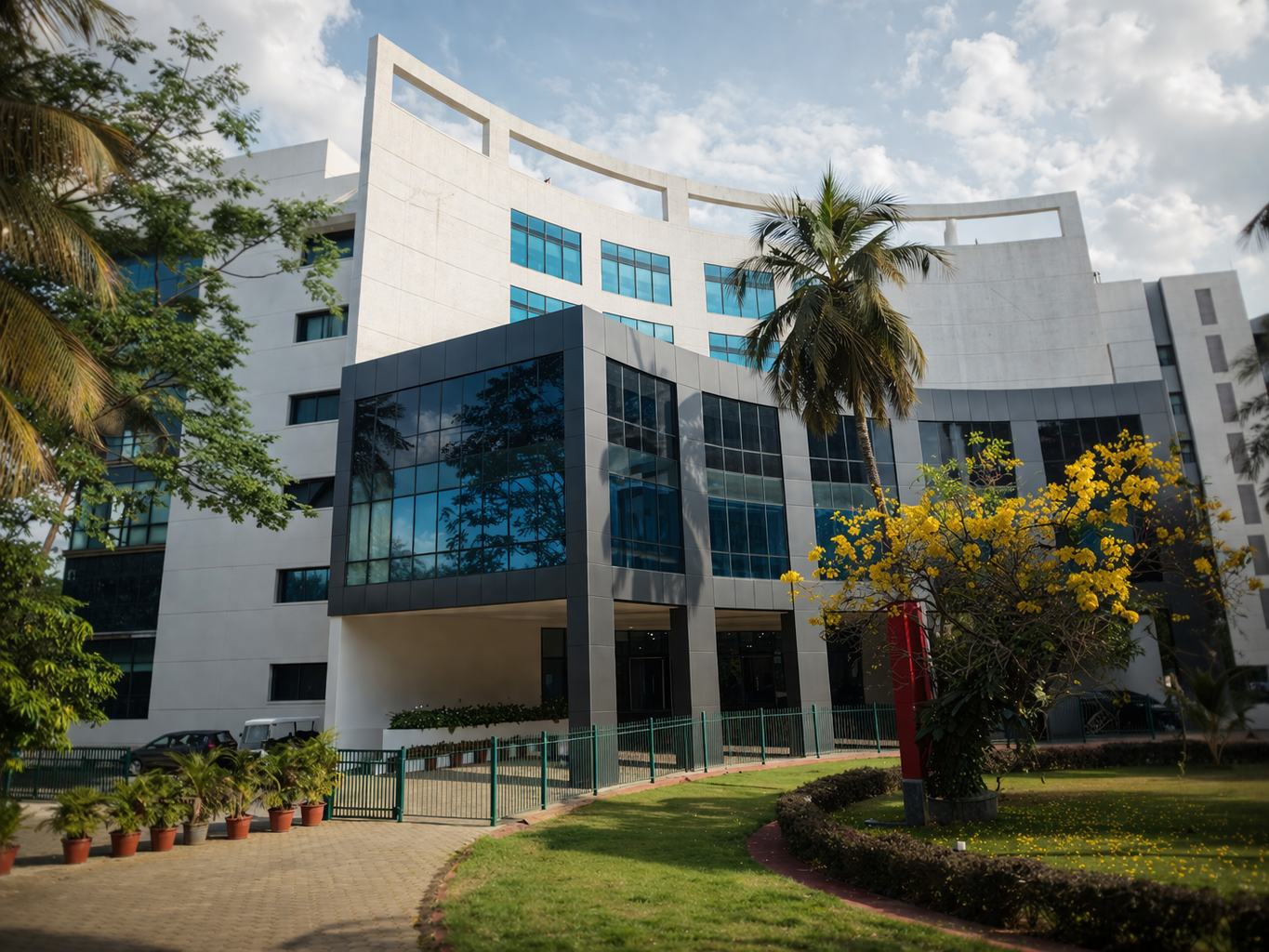
S-VYASA is NAAC A+ accredited with strong programs across engineering, management, healthcare, and yoga-based education. The reputation is real. But a prospective student landing on the website couldn't find a clear path to apply.
They'd read through pages, hit walls of unstructured content, and drift — exploring without ever converting.
Research & Insight
I walked through the full website the way a prospective student would — page by page, no tools, just observation. The same five patterns appeared across every program.
- No clear progression from interest to decision to action
- Every page tried to do too many things at once
- Content existed but had no hierarchy — everything felt equally important
- Apply actions were present but buried, not emphasized
- Each program page was structured differently, adding friction per visit
Screens
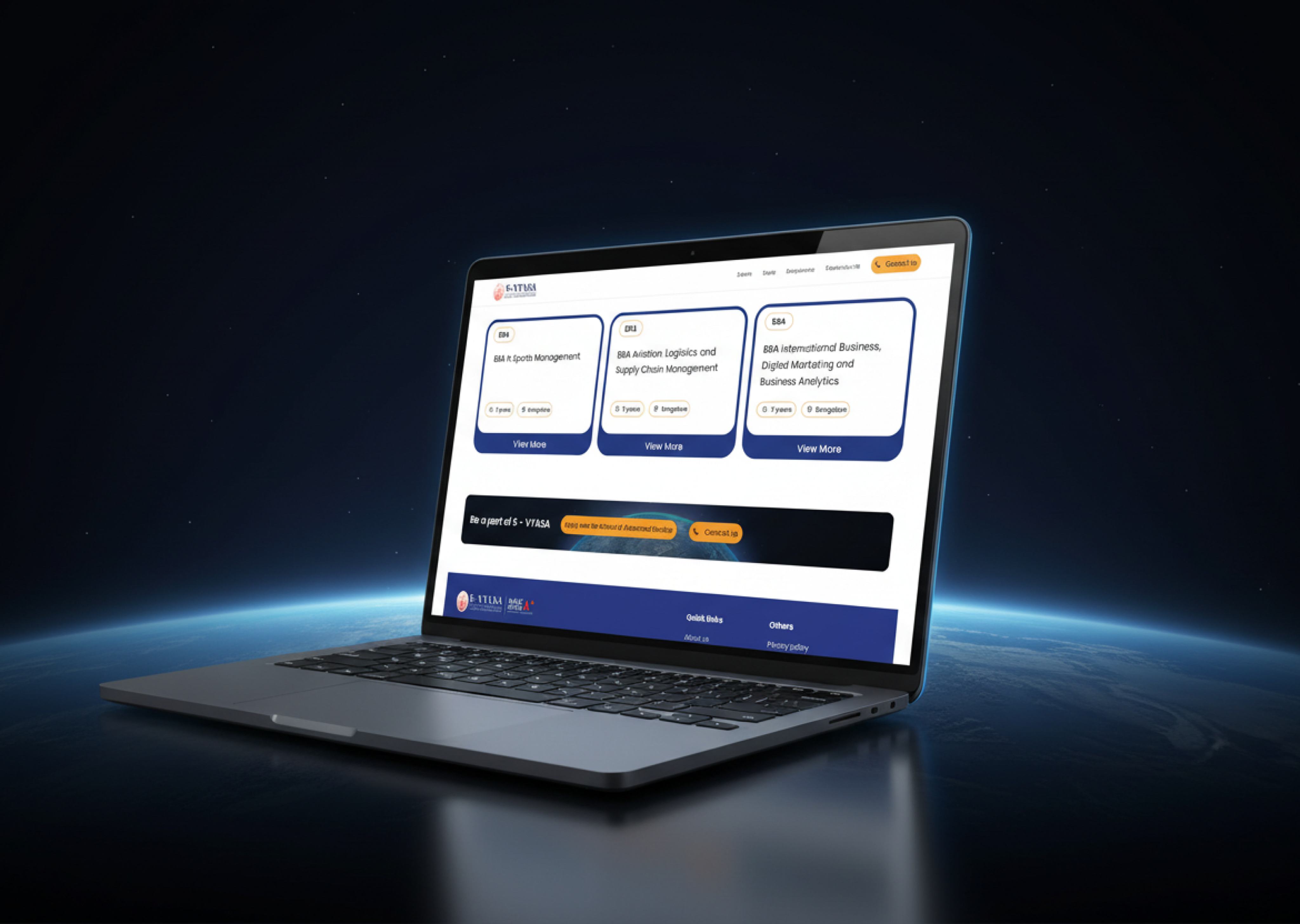
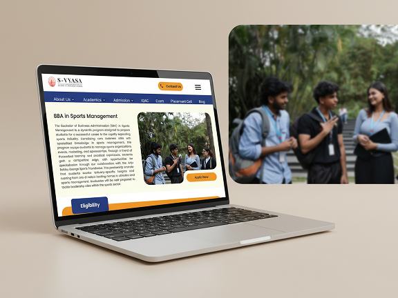
Designed to guide, not overwhelm
The redesigned experience helps students easily understand programs, compare courses, and make informed decisions.